
the history of the CP logo
A lot can happen over 13 decades. Apart from obvious historical and technological developments, one of the most visible changes that occurs in a company is the evolution of its logo. Canadian Pacific Railway (CPR) lived out its construction years having only “Canadian Pacific Railway” in block letters as its company logo. The only distinctive flight of fancy the company would allow itself was to arrange the words “Canadian Pacific” slightly arched on the side of its boxcars and cabooses.
-
- 1886
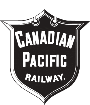
After the driving of the Last Spike on November 7, 1885, CPR readied itself for the first transcontinental train run leaving Montreal and Toronto on June 28, 1886. With the inauguration of transcontinental train service came the need for a more appealing timetable. This new folder had to be properly identified, and the company name presented in a pleasing but eye-catching manner. To do this, the printers of the first timetable rummaged through their stocks of standard printers’ block logos and came up with a spade-shaped shield. On it they emblazoned the name “Canadian Pacific Railway.”
-
- 1886 – 1889
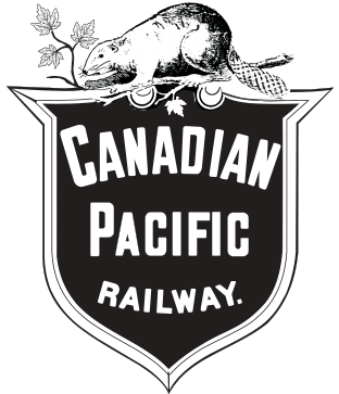
This, for all intents and purposes, was CPR’s first corporate logo. By the end of 1886, however, Canadian Pacific needed a visual link to tie it in with Canada. So CPR’s passenger department placed a beaver on the point of the shield and gave it a branch with maple leaves to gnaw.
-
- 1889 – 1890
Both the beaver and the maple leaf would later be officially adopted as Canada’s national symbols. By 1889, Canadian Pacific felt it should have a distinctive shield it could call its own.
-
- 1898 – 1929
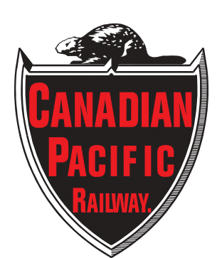
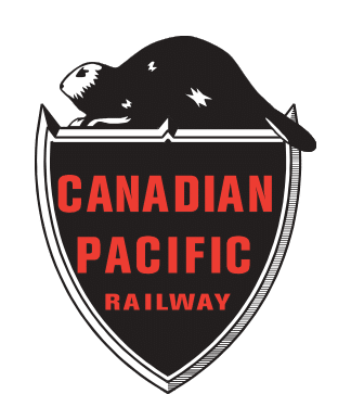
It developed a more simplified crest and gave the beaver a proper resting place. Gone were the maple leaves. Throughout the 1890s the beaver and the “Canadian Pacific Railway” lettering went through several mutations, which are not shown here, before, in 1898, a final configuration was settled on for both the beaver and the lettering.
-
- 1917 – 1929
This symbol prevailed until the end of World War I when a restless art department, tired of the Victorian approach to company logos, started to tinker with the company emblem. Circling the beaver-dominated crest with the words “Canadian Pacific,” they left the crest free to sport a maple leaf. This logo made its debut on motive power and rolling stock while the older beaver crest remained on the timetable covers.
-
- 1929 – 1946
Canadian Pacific used the newer shield to pioneer an employee incentive program that would see certain selected locomotive engineers with longstanding, accident-free records rewarded. The rewarded person’s name was incorporated in the circle around the beaver crest. This individualized adaptation of the company crest would then be affixed to the employee’s own assigned steam locomotive.
By 1929, however, the company’s growing multi-modalism necessitated a new look. The shield remained but the beaver went. At this point, Canadian Pacific was known as the “World’s Greatest Travel System.” This slogan, used for the railway lines, could be replaced by a symbol within the shield representing each of the other modes of the company; such as a hotel crest, a ship, a telegraph pole, a truck, and so on. By 1946, Canadian Pacific was ready to span the world. To do this the company called on its old friend, the beaver.
-
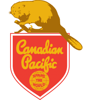
- 1946 – 1949
More prominent than ever before, the beaver regained its perch atop the Canadian Pacific shield. This time, the slogan inside the circle changed to “Spans the World.” By mid-1949, though, the “Spans the World” slogan had already had its day.
-
- 1949 – 1959
Throughout the fifties, the beaver crest continued to appear on most Canadian Pacific vehicles in its simplified form, although passenger steam locomotives and timetables continued to carry the “Spans the World” crest.
-
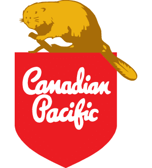
- 1960 – 1968
This persisted until 1960, when a modern touch was deemed necessary and the “Canadian Pacific” lettering was changed to the new script style. By 1968, modern times once again bid the beaver a fond farewell.
-

- 1968 – 1986
In 1968 Canadian Pacific felt it was time to give itself a progressive image that could be adapted to the growing multi-modal facets of the company. The “multimark,” a triangle and a semi-circle within a square block, signifying corporate stability, direction and world-wide capabilities, was the logo developed to answer Canadian Pacific’s modern image demands. Each of the company’s transport-related modes was assigned its own distinctive color —CPR’s (known then as CP Rail) being red.
-

- 1987 – 1990
By 1987, changes within the Canadian Pacific transportation group had lessened the effectiveness of the multimark. So it was phased out, leaving “CP Rail” in its distinctive typeface as the logo.
-

- 1990 – 1996
In April 1990, the Soo Line of Minneapolis was integrated into CP Rail, and the word “System” was added to better capture the scope of the new single-line transportation company. The acquisition of the Delaware & Hudson in January 1991, brought more North American markets within the company’s reach.
-

- 1993 – 1996
To visually evoke its broader North American reach under the “CP Rail System” banner, CPR came out with a new symbol in 1993. Using components of the U.S. and Canadian flags, CPR applied this symbol to motive power, some road and rail equipment, and most of its marketing communications and advertising.
-

- 1997 – 2007
-

- 2007 – 2011
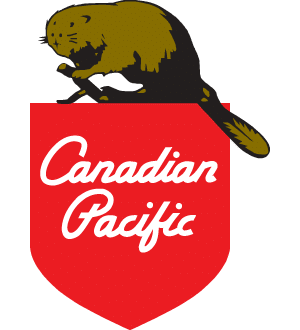
In July 1996, 25 years after the name officially disappeared with the creation of Canadian Pacific Limited (CPL), the rail entity of CPL reaffirmed its separate status and regained its old name: Canadian Pacific Railway.
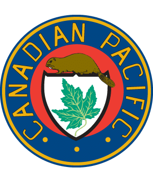
In September 1997, to properly portray its separate status and rekindle its heritage, CPR launched a retro-looking logo, complete with beaver, maple leaf and year of incorporation. CPR kept its distinctive heritage logo with the October 2001 spin-out of the five CPL entities into stand-alone companies. CPR is evolving the use of its name to reflect the potential for growth within the rail industry, and to take advantage of diverse opportunities outside the rail industry.
The beaver and shield — adjusted slightly, with Canadian Pacific replacing Canadian Pacific Railway — was put in place for all corporate markings and was a symbol held in high esteem by employees.
-

- 2012 -2016
In 2012, it was time to signal a new direction for the company, a re-energized focus on the future, our customers and new markets. The bold design of our logo buttressed the strength of our foundations and expressed our confidence moving forward. The clean and crisp design spoke to the simplicity and elegance of our operating model.
the CP logo today
After CP regained its rightful place in the industry, it was time to acknowledge CP’s place in history and its role in driving the North American economy forward.
Combining our bold modern CP logo mark with the heritage shield, CP’s new logo renews Canadians’ and employees’ sense of pride in the company that connected a nation, and connected a nation with the rest of the world. The beaver and the maple leaf are Canada’s national symbols and, justifiably, represent CP’s leading position in Canada’s past, present and future.
